This post covers the benchmarks needed to build world-class interactive demos that perform in the 99th percentile. The best of the best. Demos that get you the desired results you need to grow your business (more on that below).
If you’re looking for more general interactive demo statistics, or benchmarks for median performers, the top 25%, and the top 10%, click here 👈
What does it mean to be in the top 1%? Why should you care?
Because you built demos for outcomes. Whether you:
- Add demos to landing pages to book more sales
- Embed product tours to drive sign-ups
- Leverage demos in help docs to drive adoption
- Etc.
What you care about is driving positive impacts on KPIs you care about.
The top 1% of demos convert at 8.38x the rate of the median interactive demo.

Let's illustrate an example to give you a sense of how much impact that can have on your business. Let’s say you’re a product-led company that drives product sign-ups from traffic on your website.
It’s now well-known that interactive web page demos drive more sign-ups. But the difference between an “okay” demo and a world-class one is staggering.
For this example’s sake:
- You have embedded an interactive demo on your homepage.
- Your page gets around 10k visits per month.
- Out of those pageviews, 1,000 people play the demo each month.
After 12 months with a median demo, you will have generated → 720 sign-ups.
After 12 months with a median demo, you will have generated → 8,040 sign-ups!
Improving your demos could be the difference between flat and exponential growth for your business. Scroll down for benchmarks and ways to improve your demos ⤵️.

This is even more important, considering that best-in-class demos have higher completion rates (as seen below) and that it correlates with a higher likelihood of taking multiple activation steps in onboarding.
In a nutshell, → Better demos = More high-quality conversions that turn into lifelong paid customers.
How did you come up with the data?

First, we analyzed 37,000 Arcades built across 9000+ teams and companies.
Second, we looked at research done by other industry players, such as Navattic and HowdyGo (sources at the end of this post).
❗The benchmarks listed below are for the top 1% of demos. For more interactive demo statistics, click here.
2025 Benchmarks: How do best-in-class interactive demos perform?
🕹️ 98% of viewers get past the first step
Play rate → 98%
Play rate = % of interactive demo viewers who get past the first step in your demo.
🕹️ 100% of viewers get to the end of your demo
Completion rate → 100%
Completion rate = % of viewers who reach the final step in your interactive demo.
🕹️ 67% of viewers take an action
CTR → 67%
CTR = click-through rate = % of viewers who take action (click on a call-to-action button).
🕹️ The average viewer spends 3.52 minutes engaging with your demo
Minutes watched → 3.52m
Minutes watched = time spent by someone actively engaging with your demo.
🕹️ Your demo outperforms videos by at least 10x
Video CTR → 3.21% (industry average)
Video CTR = Click-through rate from video assets.
Demo CTR → 67%
Here’s an example from Quantum Metrics 👇

Link to the full article on video vs interactive demos.
❌ Myth: A great demo shouldn’t take a long time to make
Spending more time on a product tour doesn’t equal better results.
In fact:
- The average time from purchase to published demo is 10 days with Navattic.
- The average time from purchase to published demo is 6 minutes in Arcade.
- The average CTR on a top 1% Navattic interactive demo is 32.25%.

- The average CTR on a top 1% Arcade interactive demo is 67% (2x higher).
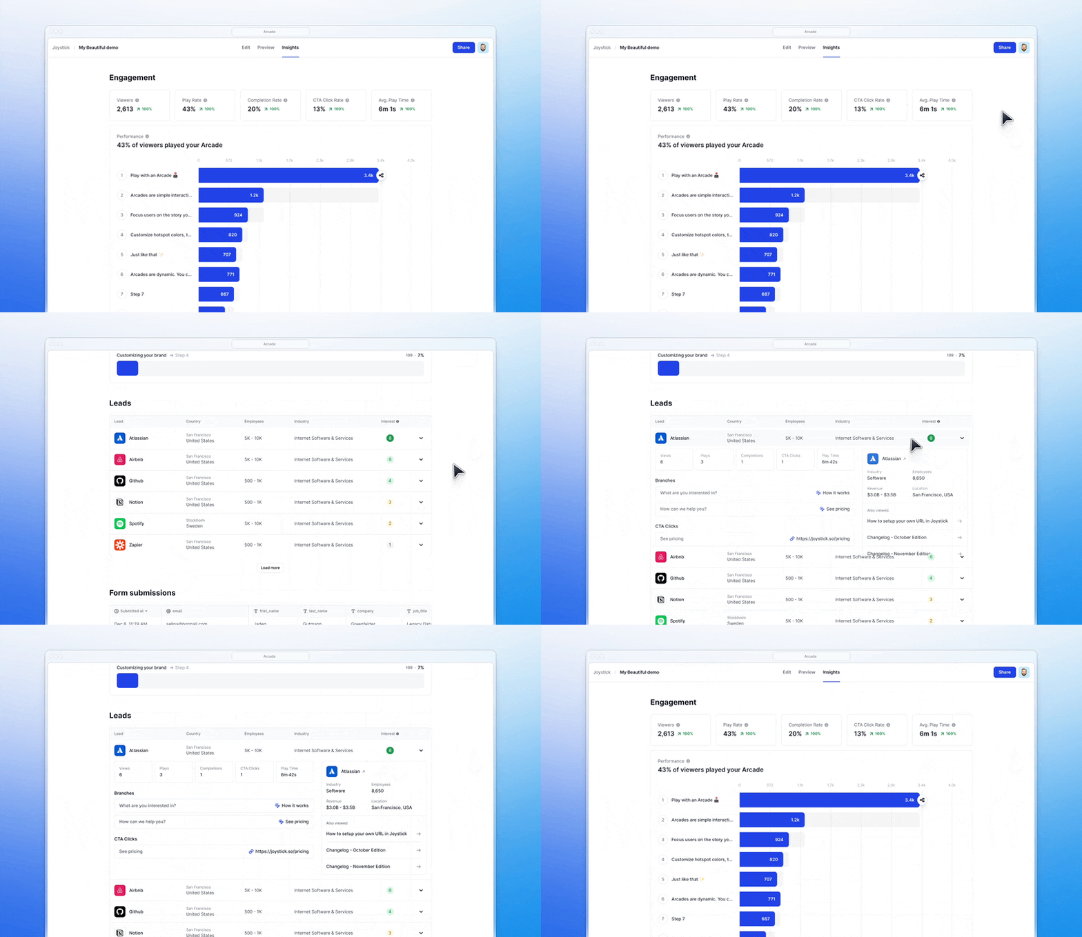
Head to Insights in Arcade to view how your demos stack against the top 1%. 👇

2025 Benchmarks: What do best-in-class interactive demos have in common?
💡 These benchmarks highlight “ideal” data points, offering guidance on what great demos often share in common. However, they’re not strict rules. Some exceptional demos don’t align perfectly with these metrics, and context matters. Ultimately, the best demos are those that deliver the most value to customers, not the ones that simply meet a checklist. Use these benchmarks as inspiration, not as absolutes!
🕹️ The best demos have 12 steps
Here’s a 12-step Arcade demo from Hunter 👇
🕹️ The best demos have more intro chapters (1.2x more)
Chapters let viewers pick what they want to do next. Adding an intro chapter to an interactive demo increases the play rate by 72%.
Here’s an example 👇
🕹️ The best demos keep each step’s instructions below 30 words
People’s attention span is short. Too much text creates drop-offs.

🕹️ The best demos have between 1 or 2 CTAs, and multiple CTA types

Although adding a bunch of CTAs for prospects to choose from may be tempting, it doesn’t correlate with a higher CTR.
What can be done is add multiple paths for viewers who do not want to convert on your “direct” CTAs, like this example ⤵️

🕹️ The best demos value visual appeal
Out of the top 1% of demos:
- 100% have “on-brand” visual guidelines.
- 9% more backgrounds are used.
- Sound is leveraged to increase the play rate by 8%.
- Video transitions are used to showcase more complicated or longer steps.
🕹️ The best demos leverage more than hotspots and callouts
In 80% of the top-performing demos, we can observe advanced effects like Pan & Zoom 👇
🕹️ The best demos have branching paths
Branching paths are presented to viewers once they click on a chapter, so that the content of the demo changes based on chapter clicks. Here’s an example 👇
Sources ⤵️
- Arcade’s 2024 interactive demo benchmarks.
- Internal proprietary data from Arcade.
- Navattic’s state of the interactive product demo.
- HowdyGo.

.jpg)


